Project Overview
Airtasker is a Sydney (and London) -based Australian company which provides an online and mobile marketplace enabling users to outsource everyday tasks. Users describe the task and indicate a budget, community members then bid to complete the task.
The user experience has only been recently considered and their app and website need a refresh to increase the user engagement and seduce their new Londonian market.
I came on board to help redesign the ‘My Tasks’ section of the Airtasker iOS app.
I was not given any data so decided to conduct my own user research, make some assumptions, and come with the start of a solution.
My goal here was to reduce cognitive load and increase conversions by making the overall experience as easy as possible.
The Current ‘My Tasks’ Screens
Process
Discovery
Competitive Analysis
I did some research on similar platforms.
The closest I found that was not serving the same industry but had a similar model (=all users can both be “givers” and “receivers”) is Gumtree.
I analysed how they manage their ads and how a user can post something.
I also had a look at Freelancer, and some other apps used in non-English speaking countries and took note of the patterns that were most commonly used.
User Interviews
I conducted some user interviews.
The first user had already used the app many times previously. She had posted tasks, approved some, had some that were expired, etc.
The second user had never used the app before, but had heard of it. I got him to sign up, and then watched him interact with the different sections of the app.
I didn’t ask any question. This was just a phase of observation.
With both users, I took a lot of notes and listened to them describing their experience, their doubts, questions, and emotions.
Findings
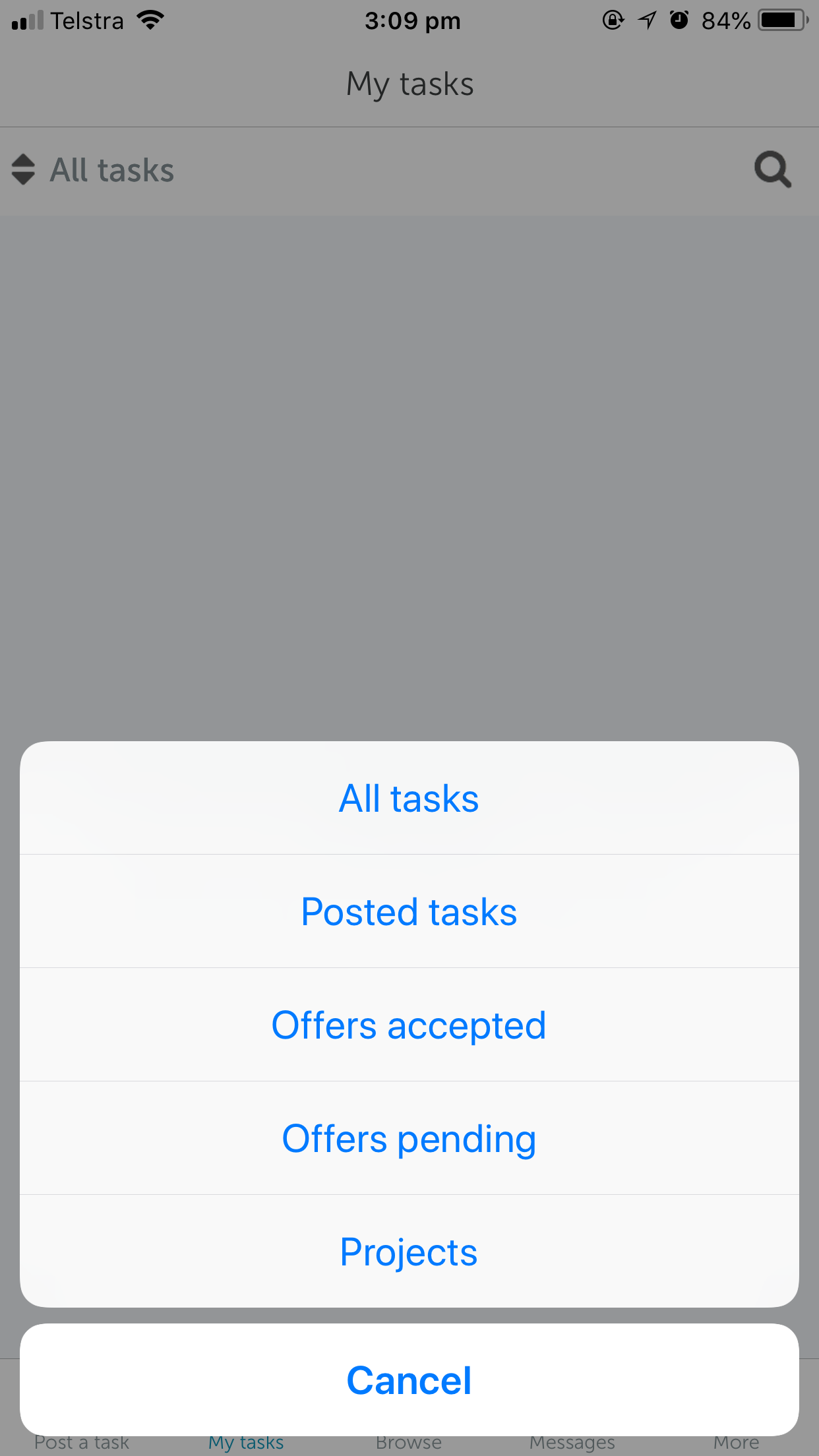
For the user that had already used the app, there was a lot of frustration around the Tasks management. She didn’t like the way they were ordered / filtered (All Tasks, Posted Tasks, etc), and didn’t think it was relevant for the way she would want to use the app. Also she thought it was hard to understand quickly which tasks had had a reply.
Finally, she said the interface was a bit clumsy and too busy.
The second user felt that posting his first task wasn’t that intuitive. He was worried the process could take too long, wasn’t sure where to start, and was wondering if he had to accept someone’s offer. Overall, he thought the process was a bit daunting.
Define
I reviewed the iOS app to determine how it could be more intuitive, based on the users feedback and on my own research. After gaining a valuable understanding of it, I defined two main areas I wanted to improve:
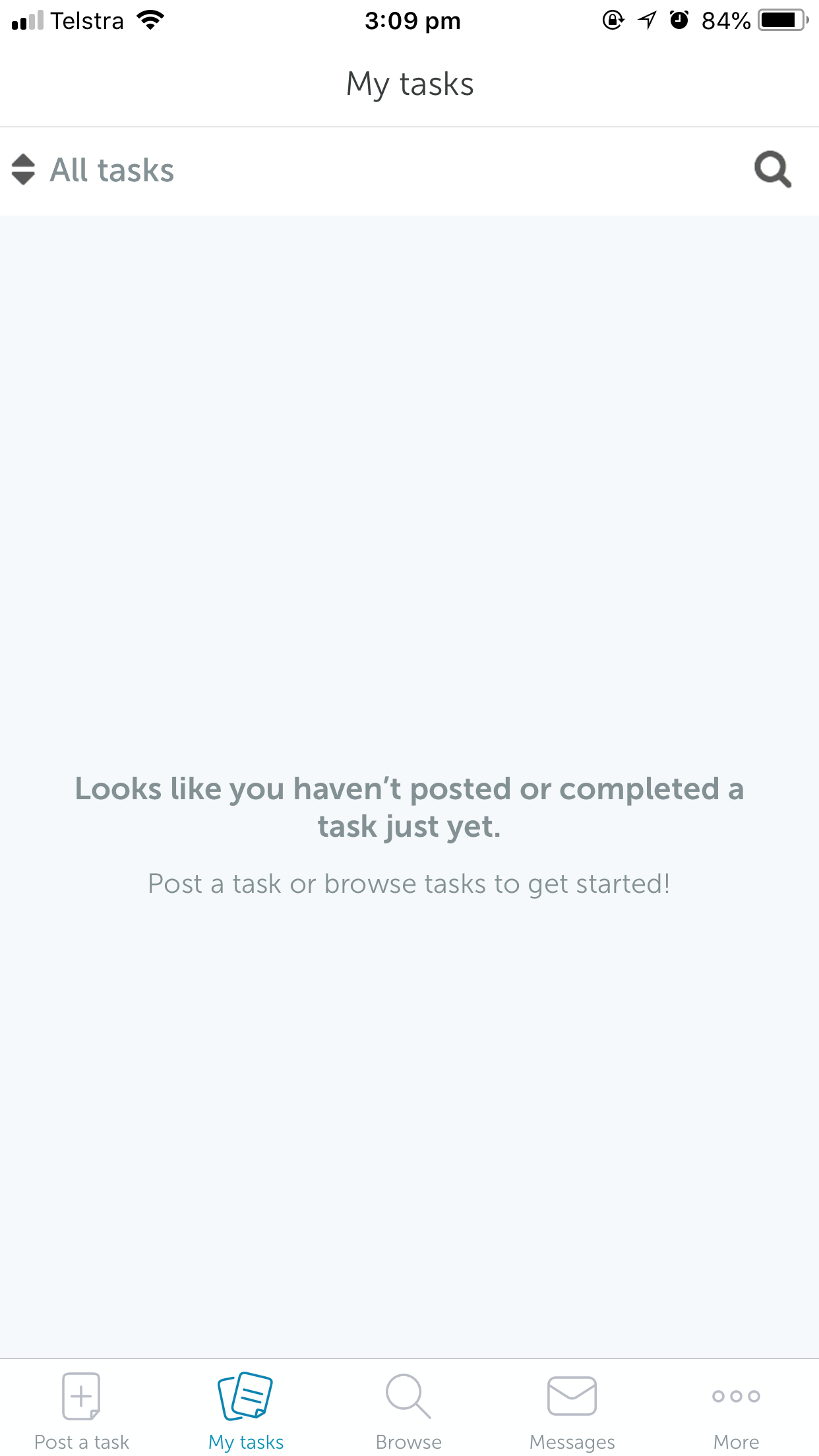
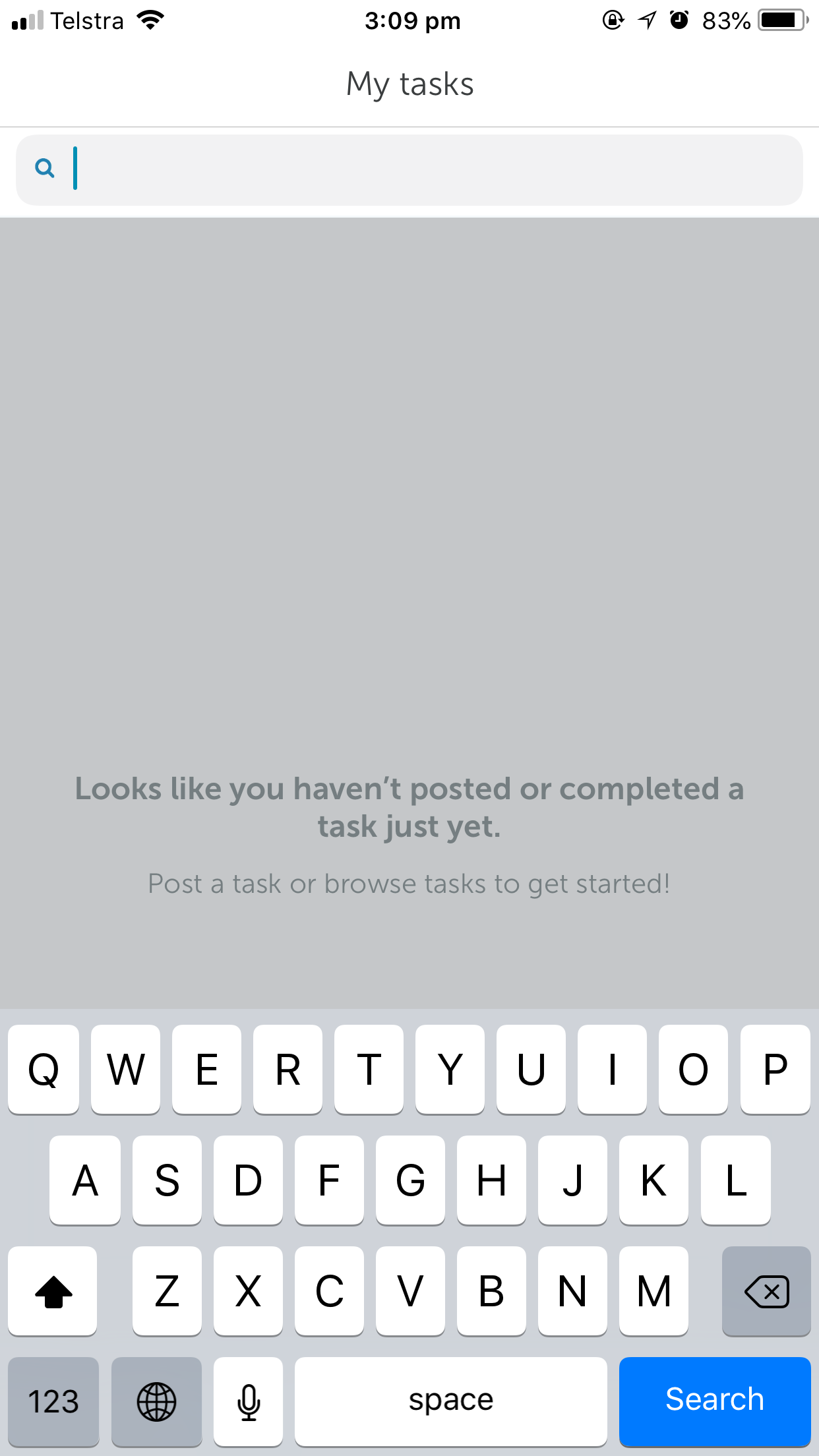
Revamp the Empty State of the My Tasks screen for a first time user in order to encourage action.
Better the My Tasks screen for a user who’s already posted tasks, improve its hierarchy and tasks management.
Result
Empty State
After internalising the information I found, I used it to figure out what I should build to solve this design problem.
My first approach was to see the empty state of the My Tasks screen as an opportunity to educate and encourage first-time users to post their first task. Using series of comments like “Come back to a clean home!” not only explains the outcomes of using Airtasker (it doesn’t matter how the house gets cleaned, what’s important is to get it done), but also plays with the sentiment of urgency (“it could be done today!” “one thing I can finally tick off my list”).
Another nice addition would be to use local lingo, like Australian slang for the Australian market. That would create an emotional attachment towards the Airtasker brand and users would feel it’s personalised to their culture.
Also, the user gets reassured that posting a task is only a matter of a few minutes.
The “Post A Task” is now a big + button that’s central in the dashboard, encouraging more users to post tasks, therefore more users would join and use the app to execute tasks.
More traffic, more engagement, win-win!
This button is also highlighted by the arrow that’s animated (moving up and down) on the empty screen.
My Tasks screens with Empty States
Tasks Management
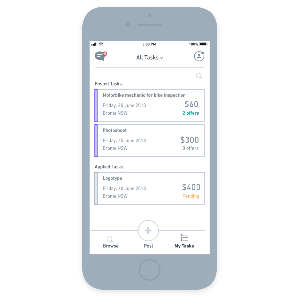
Before starting on the Task Management issue, I realised that the Tasks hierarchy wasn’t quite logical. At the moment, if you’ve applied for a task, you only see it when selecting “Offers Pending”, and you don’t see it in “All Tasks”.
I decided to change this structure to make sure end-users don’t get confused.
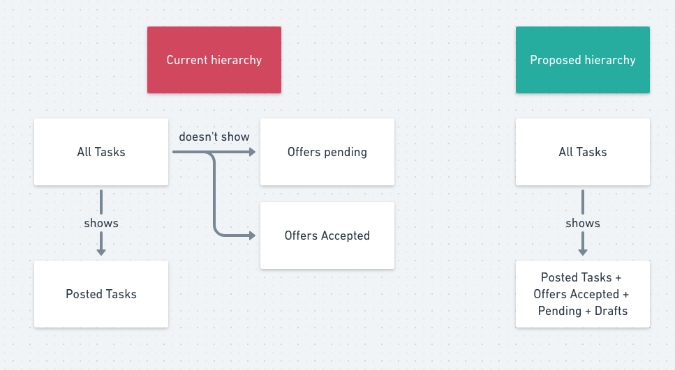
A different flow
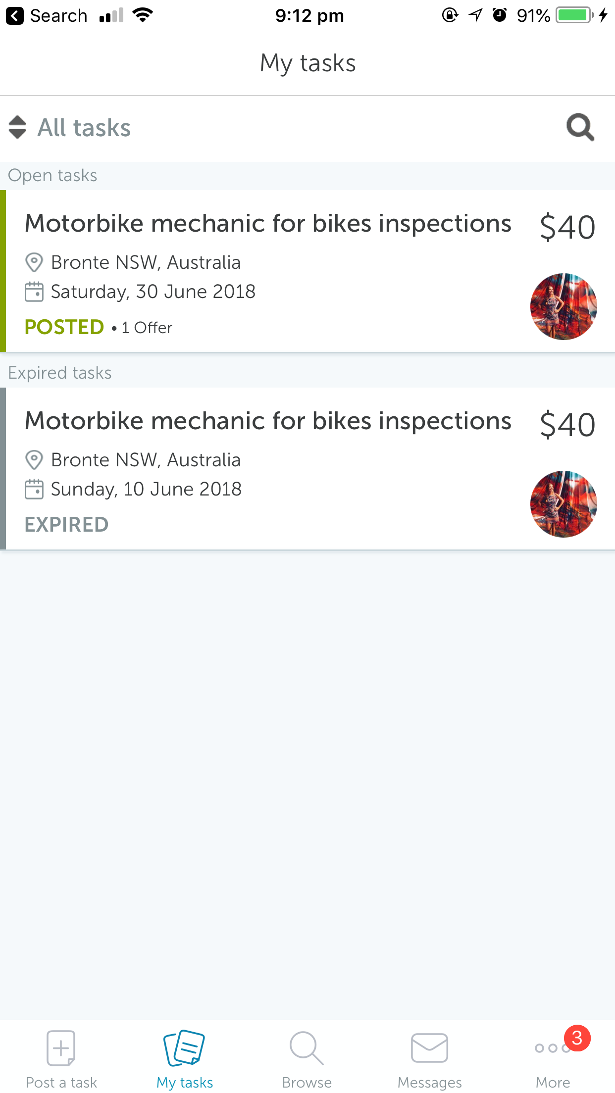
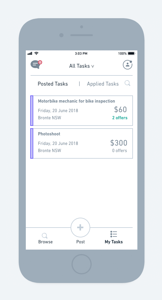
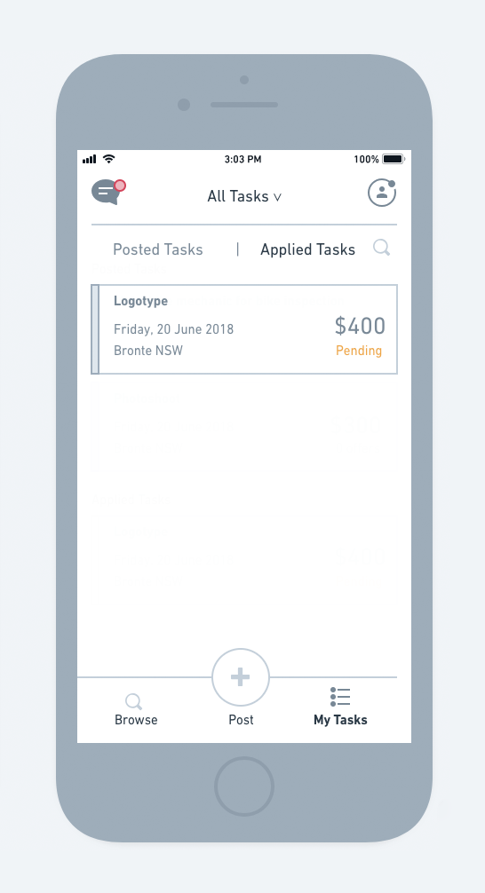
On the following screens, we can see that I’ve separated the Posted Tasks from the Applied Tasks.
Their status is shown clearly on the side of the task. There is one colour for posted tasks (here it’s purple) and one for applied tasks (grey in the example). Then, each status has a colour code too.
Another big change is that the message system is now at the top of the screen. On the old interface, the user had to click on a task to see the offers. On the new interface, the message system groups all the offers by messages (this is just an idea for now as I haven’t explored the message system as much as the rest).
My Tasks screens with tasks posted and applied for
Testing
I then conducted some user tests with the wireframes I created previously.
Both users found the overall experience much easier and intuitive.
“It’s easier on the eyes…”
“Oh! Now I can access my messages quickly!”
“I understand what this app is for and feel like posting something now!”